Tag: Logo Design

  • Pagecraft.in

    Pagecraft.in

    Brand Strategy · Logo Design · UX Research · UI Design · WordPress Development · Responsive Design

    Web Design & Development

    Logo Pack · Wireframes · High-Fidelity Screens · WordPress Website · Content Structure

    1 Months

    About PageCraft

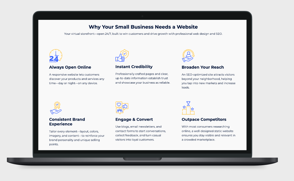
    Pagecraft is a new-age web service brand focused on helping Indian entrepreneurs, freelancers, and small businesses get online with ease. By offering all-inclusive website packages starting at just ₹3000, Pagecraft makes professional web design accessible to everyone, no matter their budget or technical background.


    The Problem

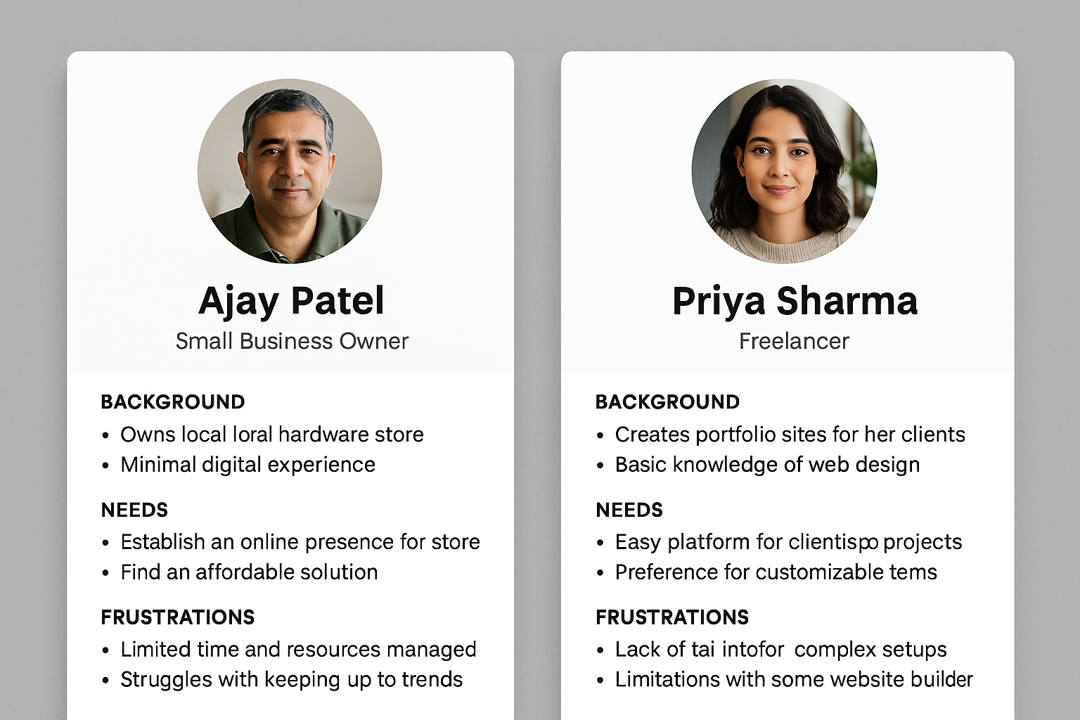
    Many small businesses in India face the same obstacles when trying to go online:

    • Long timelines with agencies that slow down business launches.
    • Confusing setup with domain, hosting, and design scattered across vendors.
    • High upfront costs make professional websites unaffordable.
    • Poorly designed DIY websites that don’t inspire customer trust.

    The Goal

    • Provide affordable, all-in-one web packages that cover domain, hosting, and design.
    • Develop a simple, trustworthy website that reflects professionalism.
    • Design a logo and brand identity that communicates simplicity and reliability.
    • Make the process fast, transparent, and beginner-friendly.
    • Use WordPress as the CMS to ensure scalability and easy management.

    Design Process

    Our process followed a Design Thinking approach, broken into clear phases:

    Research

    Studied the challenges of first-time website owners in India.

    Logo & Brand Identity

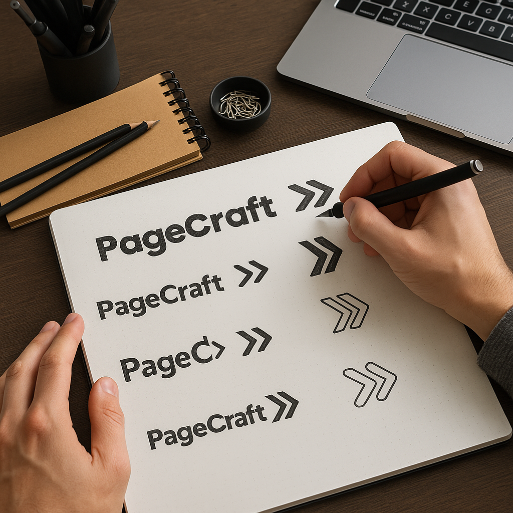
    Designed a simple, modern logo to reflect affordability and trust.

    Wireframing

    Mapped the customer journey from landing to sign-up.

    UI Design

    Clean layouts that emphasise clarity and trust.

    Development

    Implemented the site in WordPress with lightweight plugins and custom styling.

    Testing & Launch

    Ensured fast load times, responsive performance, and simple CMS management.


    The Solution

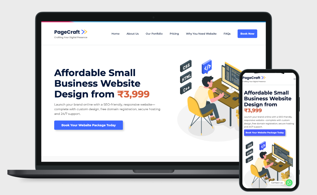
    IPS built Pagecraft as a clean, modern, mobile-first website with a strong brand identity.

    We delivered:

    • A WordPress-based website optimised for speed, security, and scalability.
    • A professional logo design to serve as the cornerstone of the brand identity.
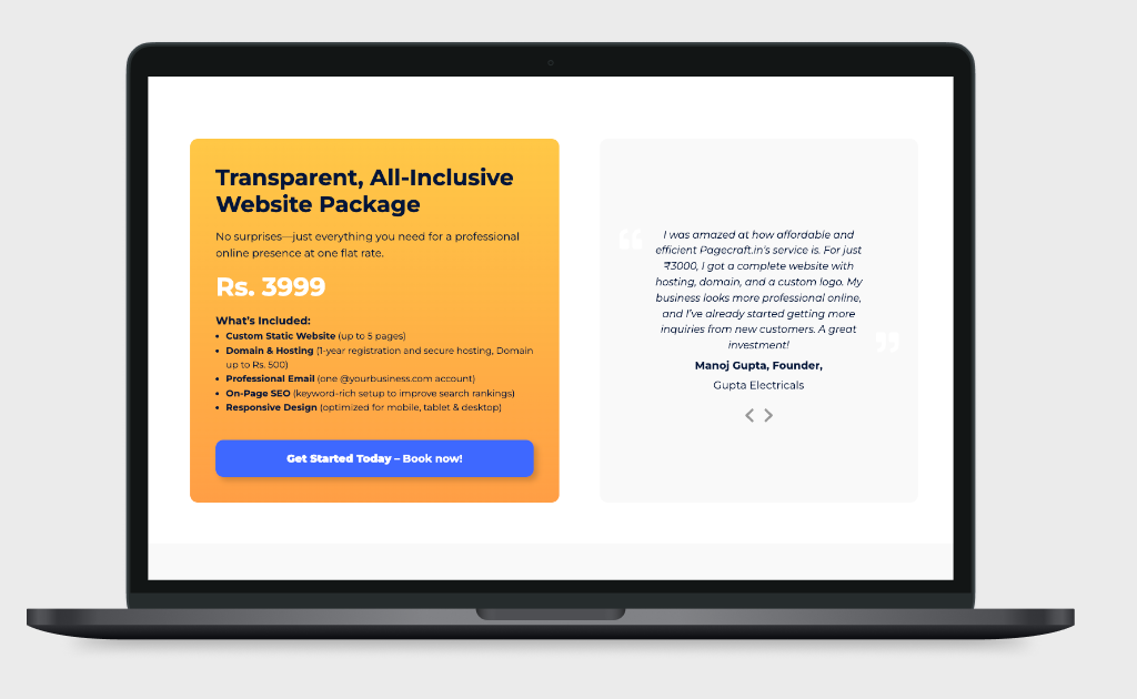
    • Clear product offerings with transparent pricing.
    • A conversion-focused homepage with simple CTAs.
    • Responsive layouts that look great on both desktop and mobile.
    • SEO-ready structure to attract organic traffic.

    Research & Insights

    • Cost and complexity were the biggest barriers for small businesses.
    • Most users preferred a done-for-you solution over DIY builders.
    • Visual identity (logo, colors, consistency) added trust and professionalism.
    • Trust signals like transparent pricing, testimonials, and clear packages influenced buying decisions.

    Design System

    • Logo: Simple, bold, and modern mark representing accessibility + professionalism.
    • Colors: Bright accents for CTAs with neutral backgrounds for clarity.
    • Typography: Clean, modern sans-serif fonts for readability.
    • Grid & Layout: Flexible sections designed for WordPress CMS blocks.
    • Components: Reusable buttons, cards, pricing tables, and forms.
    UX/UI Design

    • Focused on simplicity — minimal clicks to reach pricing and package details.
    • CTAs like “Get Started for ₹3000” are placed strategically for conversions.
    • Optimised for mobile-first browsing since the majority of users access via smartphones.
    • Integrated contact form for instant lead capture.
    Results & Outcomes

    • Pagecraft launched successfully as an affordable web design service.
    • Strong, consistent visual identity established through the new logo and brand system.
    • Early traction with freelancers and small business owners.
    • Reduced entry barrier for professional websites with clear pricing and easy setup.
    • Strong foundation in WordPress ensures the platform can scale with demand.
  • Shivaji Raging Bulls Cricket Team

    Shivaji Raging Bulls Cricket Team

    Brand Strategy · Logo Design · Visual Identity · Illustration · Sports Branding

    Sports, Cricket

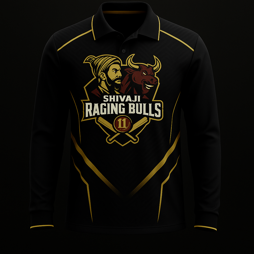
    Logo Pack · Color Palette · Typography System · Jersey Mockups · Digital Assets

    1 Months

    About Shivaji Raging Bulls

    Shivaji Raging Bulls is a passionate local cricket team looking to build a strong identity both on and off the field. Beyond just cricket, they wanted a brand that reflects their fighting spirit, cultural pride, and the energy of their players.


    The Problem

    The team lacked a professional identity that could:

    • Build pride across jerseys, merchandise, and digital presence.
    • Represent their values and energy.
    • Connect with their local community.
    • Stand out in tournaments with a recognisable look.

    The Goal

    • Create a bold, memorable logo with cultural relevance.
    • Design an identity that feels powerful and team-oriented.
    • Ensure versatility across jerseys, caps, digital platforms, and print.
    • Blend sports aggression with heritage for strong recall.

    Our Process

    Our process followed a Design Thinking approach, broken into clear phases:

    Research

    Explored local cricket culture, historical references, and modern sports logos.

    Concept Development

    Sketched logo concepts merging Shivaji symbolism with sports identity.

    Illustration & Refinement

    Detailed illustration of Shivaji and the bull integrated into one visual.

    Typography & Colors

    Bold, sporty lettering paired with powerful reds, golds, and blacks.

    Application Testing

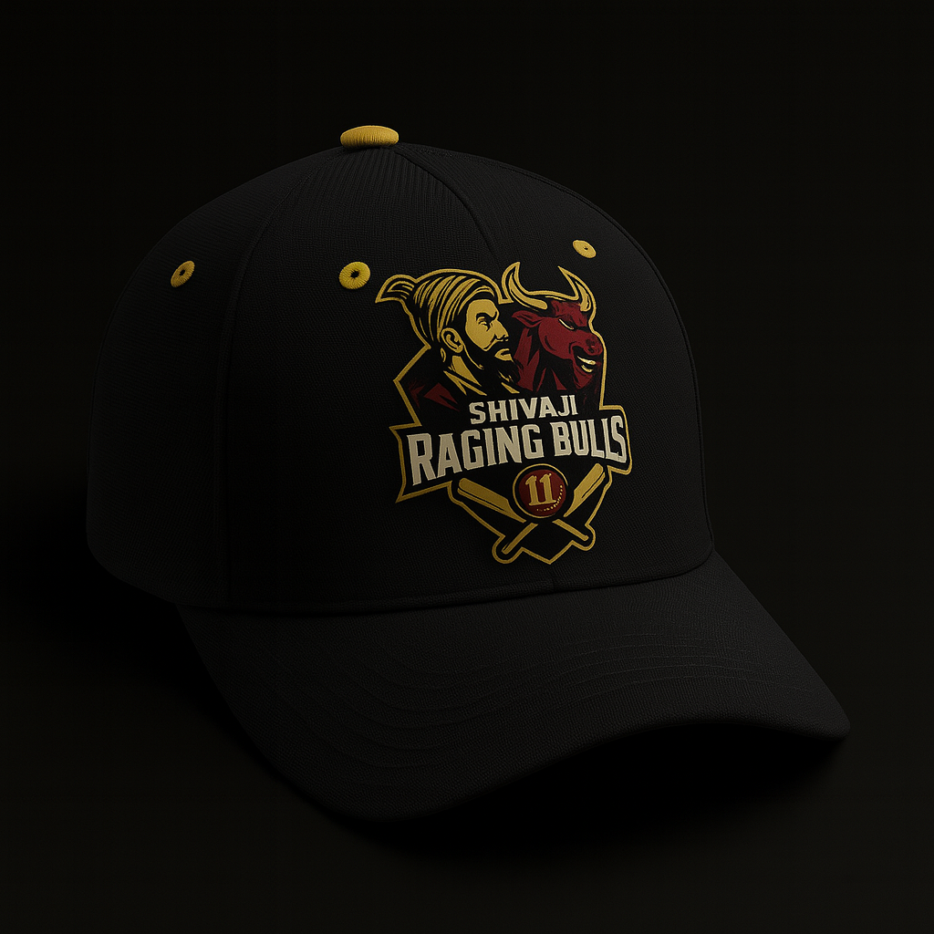
    Tested logo visibility on jerseys, caps, and digital media.


    The Solution

    IPS developed a brand identity that merges tradition with modern sports aesthetics.

    We delivered:

    • A dynamic logo featuring Shivaji as a symbol of courage and heritage.
    • A raging bull to embody aggression, strength, and competitive spirit.
    • A shield emblem combined with cricket bats and a ball to ground it in the sport.
    • Strong typography and color palette to make the identity bold and tournament-ready.

    Visual Identity & Brand Story

    The logo tells a layered story:

    • Typography – bold, sharp lettering that matches the competitive tone of the team.
    • Shivaji – symbol of courage, pride, and leadership.
    • Bull – raw power, aggression, and resilience.
    • Shield + Cricket Elements – discipline, unity, and the sport at its core.
    • Colors – deep red for energy and aggression, gold for pride and achievement, black for strength.

    UX/UI Design

    The final experience provided clarity and efficiency:

    • Credit Dashboard: request documents, monitor progress, and approve/reject submissions from one place.
    • Agent Framework: simple upload flows for DSAs/agents that auto-update the dashboard.
    • Microinteractions: instant feedback when items are uploaded, validated, or escalated.
    • Streamlined Flows: reduced friction for both Credit Managers and Sales Agents, improving throughput.

    Design System

    • Assets – jersey prints, digital banners, and team merchandise.
    • Logo Variations – full logo, icon-only, monochrome versions.
    • Color Palette – Red (#7C2022), Gold (#F7C948), Black (#1E1E1E).
    • Typography – Sporty bold sans-serif fonts for impact and readability.

    Results & Outcomes

    • A strong, professional identity that players and fans instantly connect with.
    • Boosted team spirit and pride through a unifying brand.
    • Improved recognition during local tournaments.
    • Versatile identity adaptable for jerseys, caps, and online presence.